The COVID-19 pandemic profoundly reshaped our world, highlighting the critical importance of health and hygiene. As people became more conscious of the need to protect themselves from illnesses, Lysol products quickly became essential, flying off shelves nationwide. What was once a staple household item transformed into a highly sought-after commodity, leading to intense demand and even in-store confrontations.
This surge in popularity prompted me to reassess Lysol’s brand identity. Observing the packaging, I recognized that while the product was trusted, its visual representation felt outdated. I realized that to resonate with today’s consumers, particularly the modern millennial mother, Lysol needed a comprehensive rebranding.
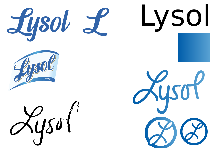
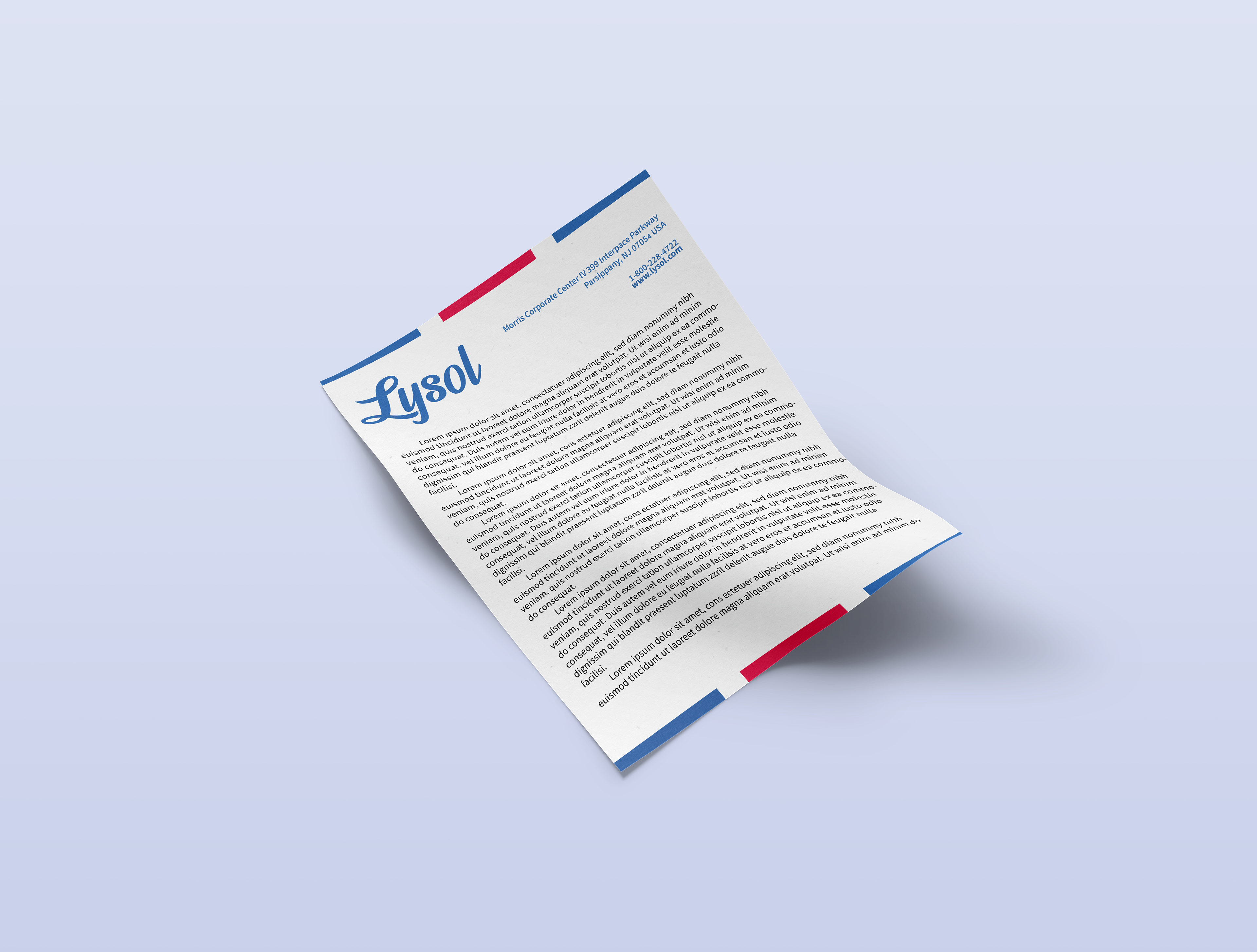
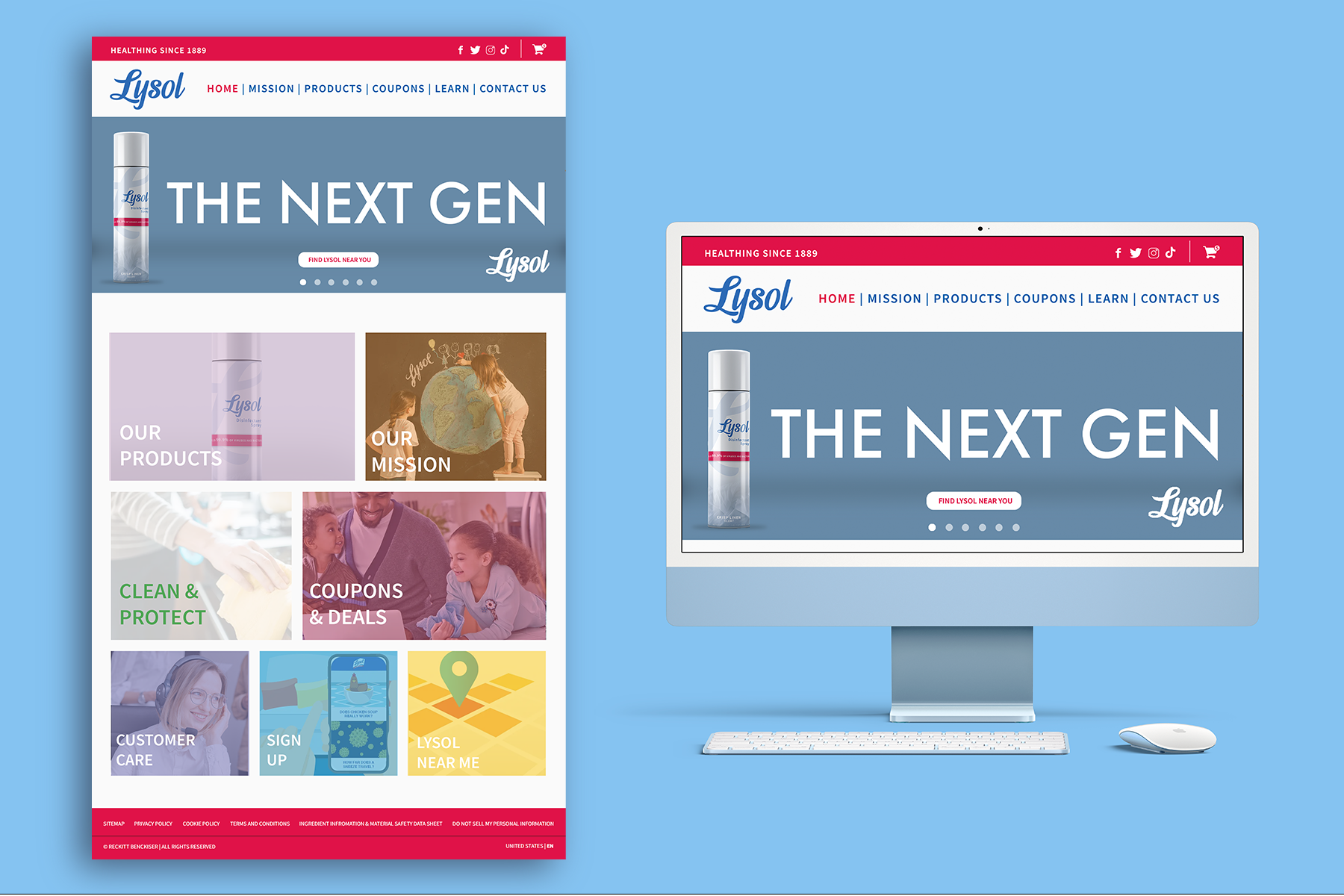
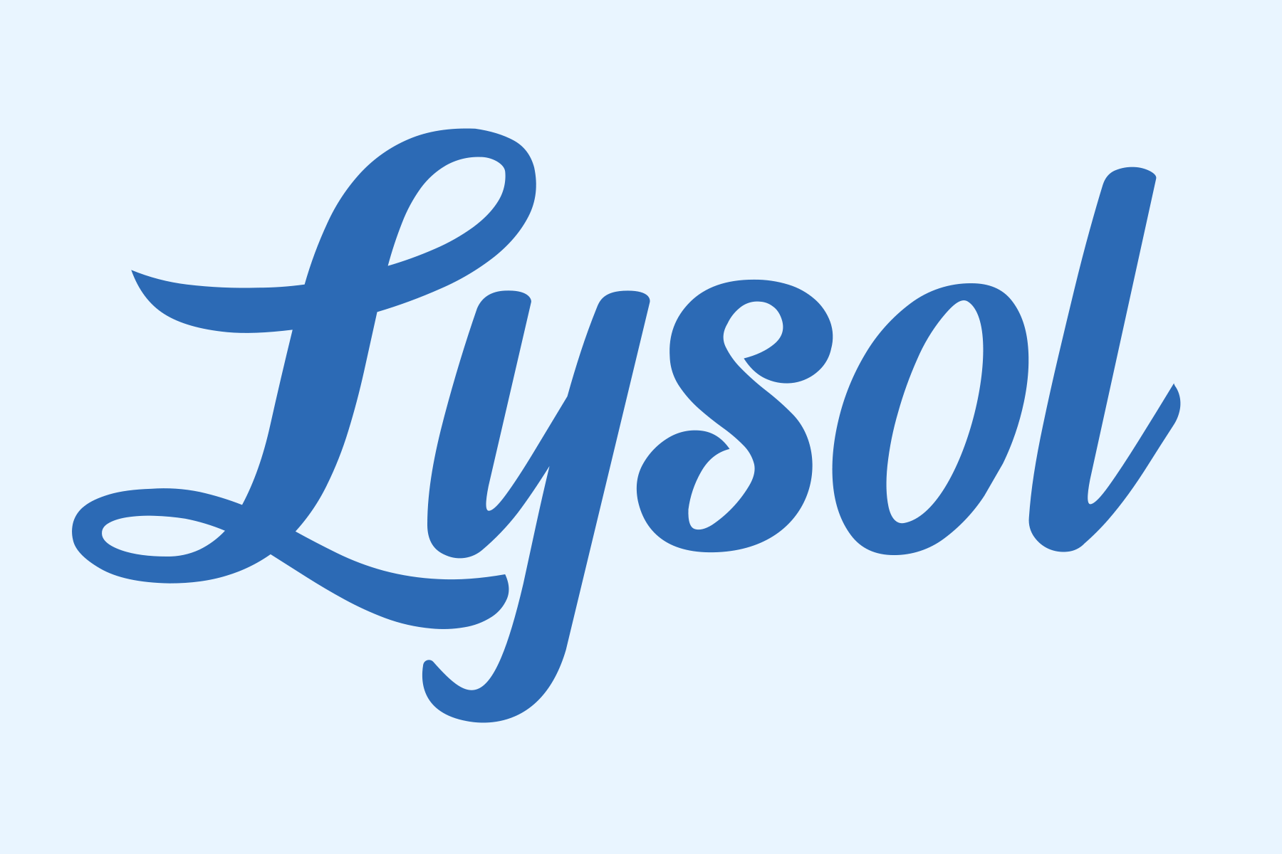
The first step in this transformation was the logo. Understanding the significance of brand equity in a company of Lysol’s stature, I opted for an evolutionary approach. I selected the Lemon Jelly script typeface, adapting it to create a unique brand mark that combined handwritten and cursive elements. This design aimed to enhance readability while preserving the brand’s historical essence, ensuring that consumers could easily recognize and connect with Lysol.
Next, I turned my attention to the packaging. Previous designs attempted to convey extensive information, resulting in cluttered and dated labels. To address this, I streamlined the design, allowing it to breathe and appeal to the aesthetic preferences of young mothers. The refreshed packaging was visually appealing, memorable, and versatile across various scents.
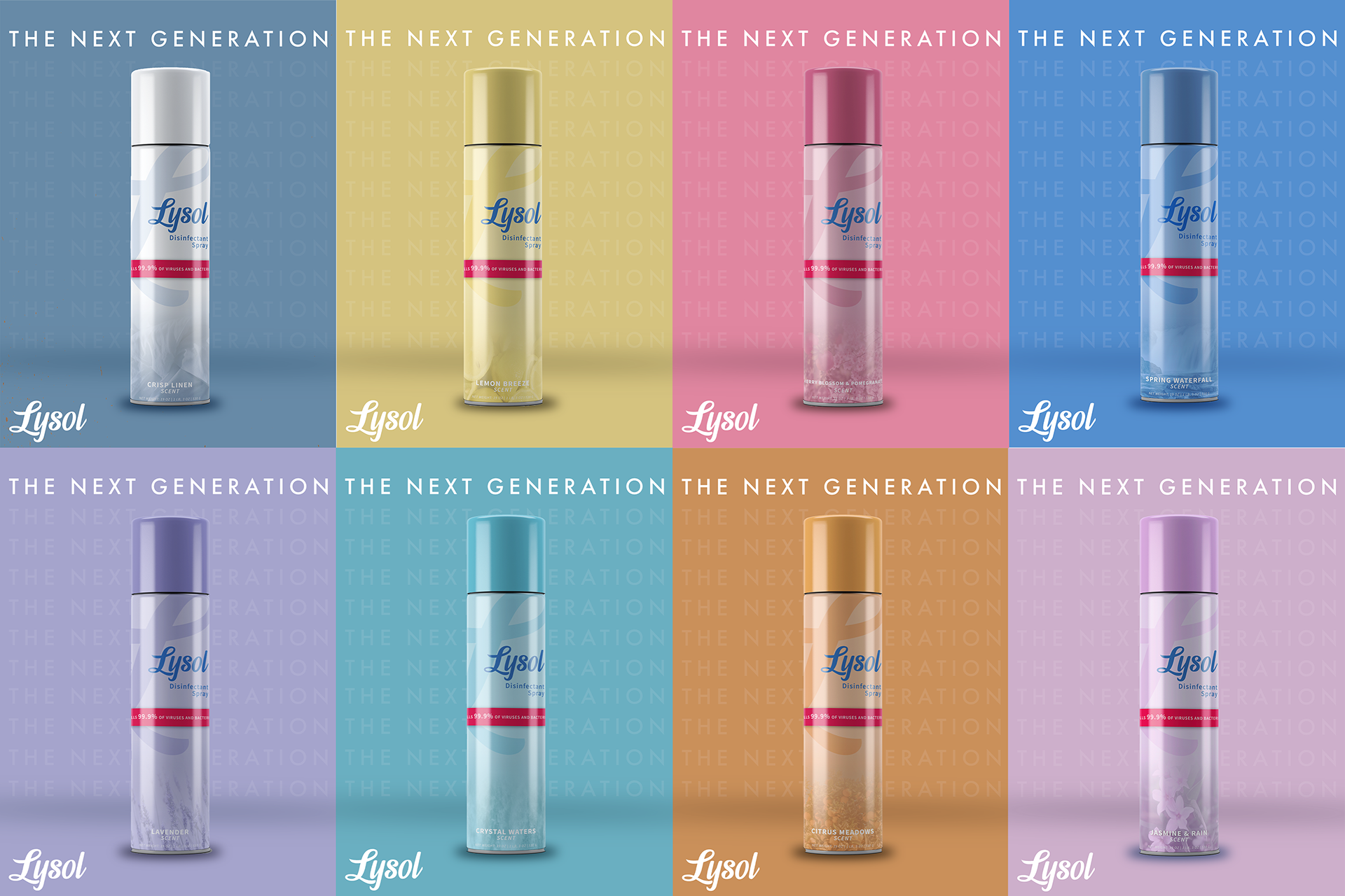
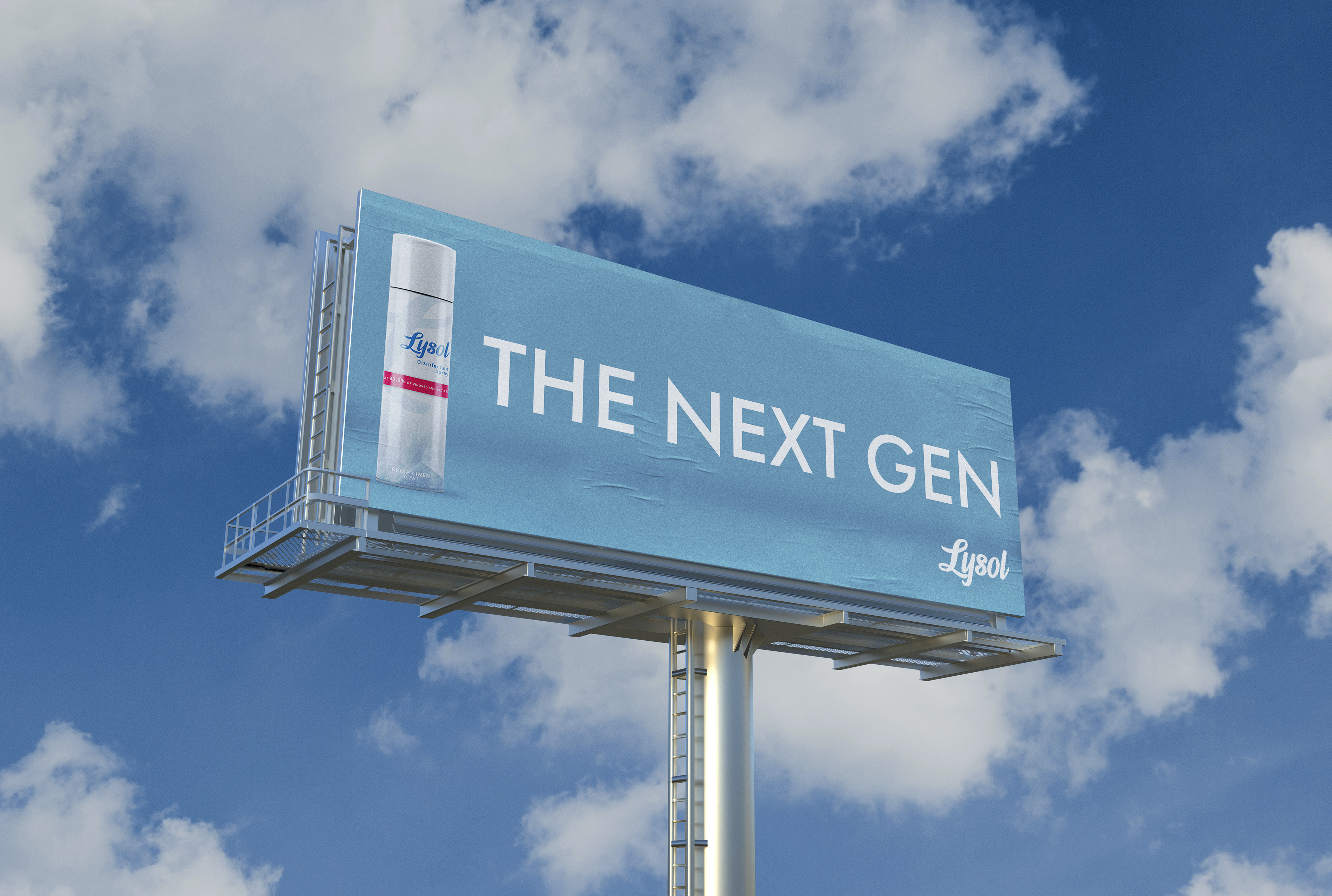
Recognizing the need for effective promotion, I introduced the slogan “The Next Generation.” This phrase not only signified a new era for Lysol’s branding but also resonated with its target audience—the next generation of mothers. The campaign aimed to establish a deeper connection with consumers, emphasizing the brand’s commitment to evolving with their needs.
The rebranding initiative successfully modernized Lysol’s image, making it more appealing and relevant to contemporary consumers. The updated design elements worked cohesively to reinforce the brand’s legacy while positioning it for future growth.