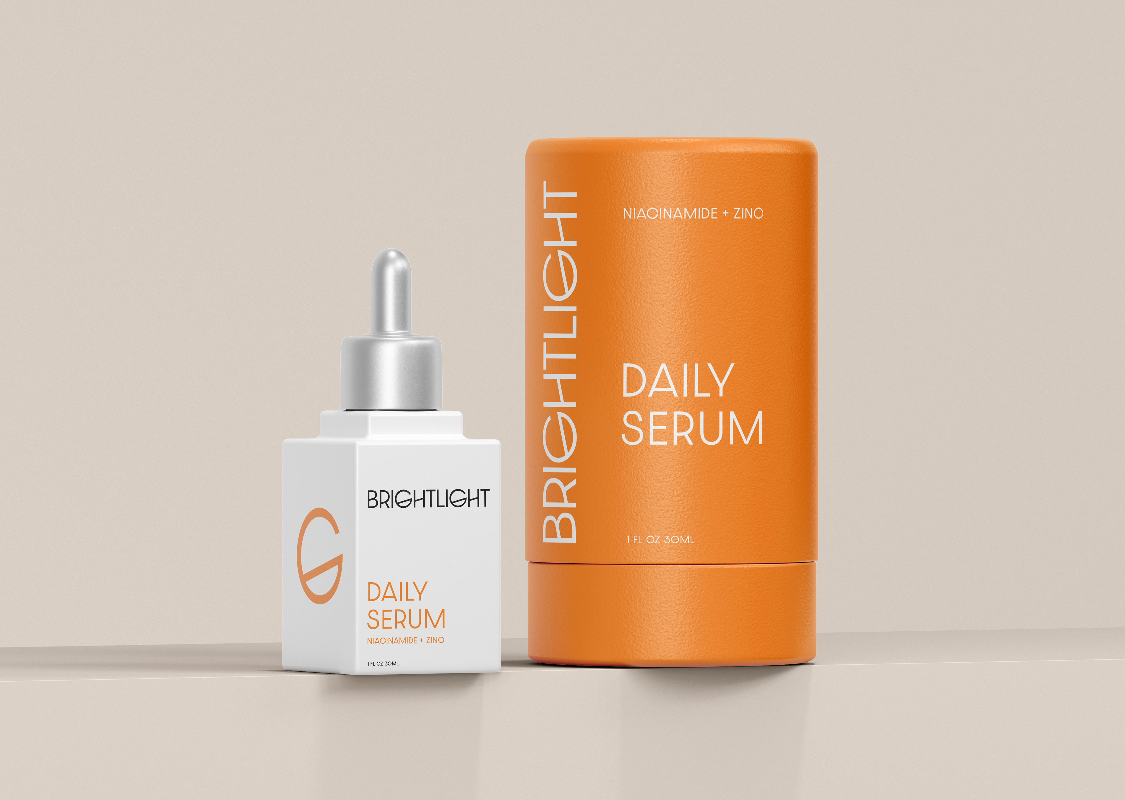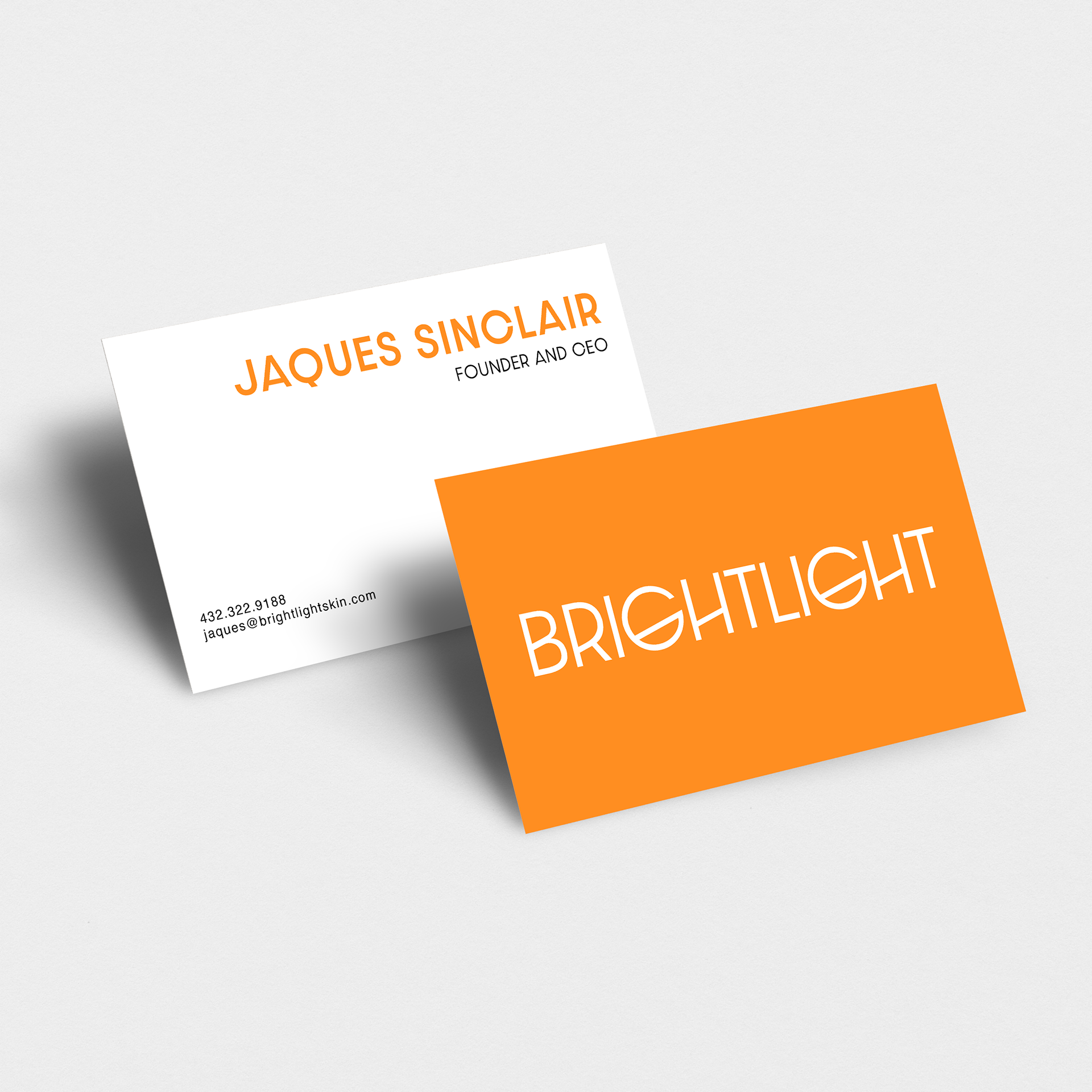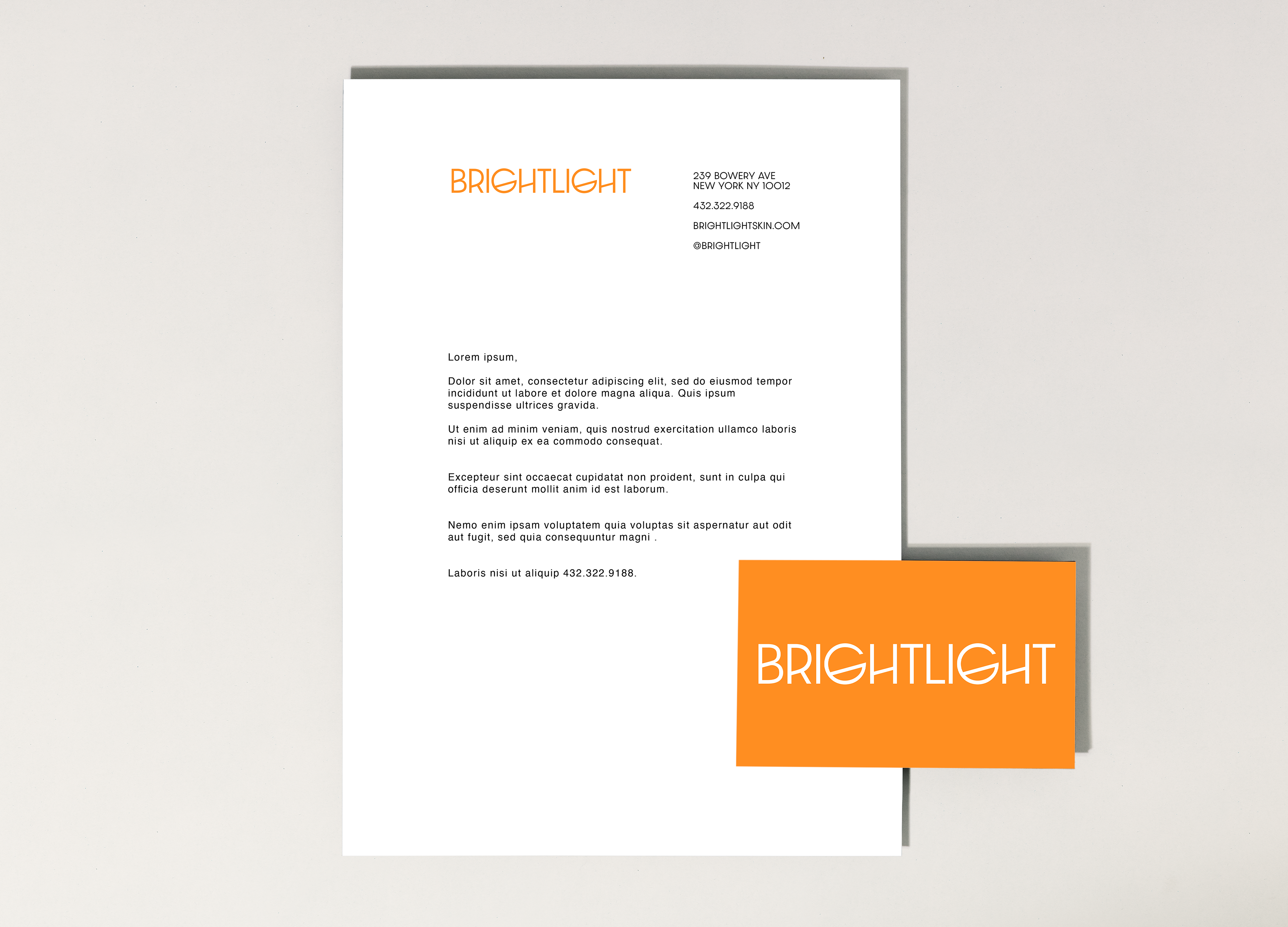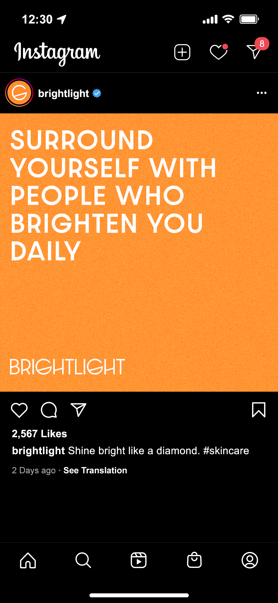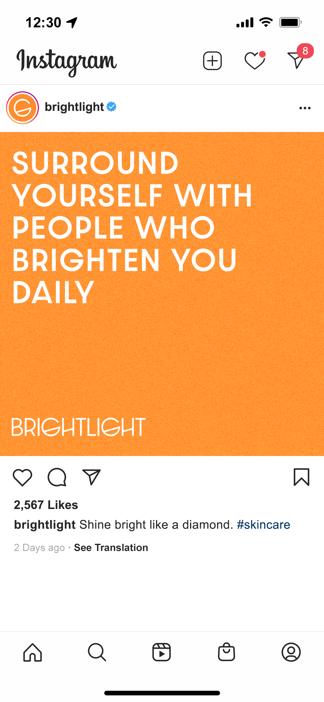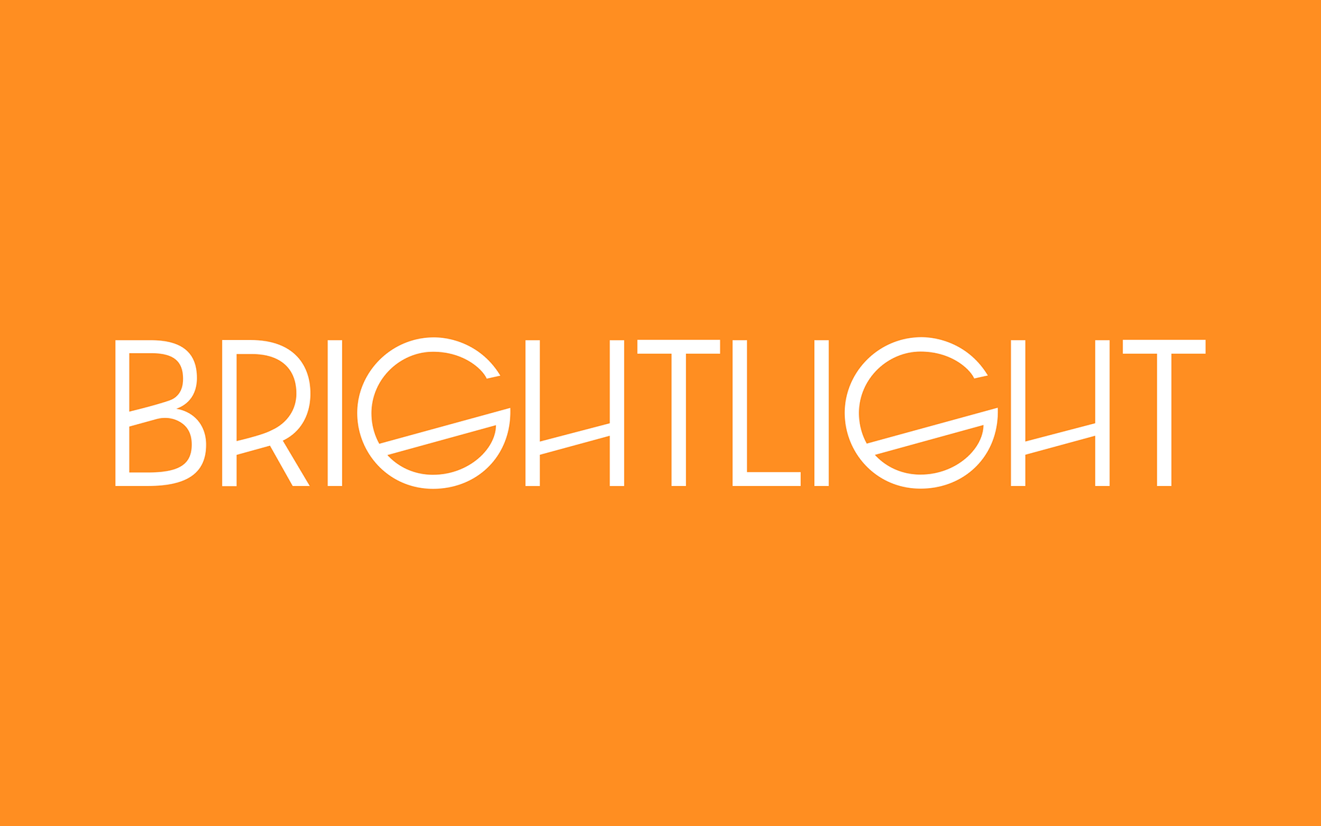
The task was to create a visual identity for a premium startup skincare brand, BrightLight. The brand was to appeal to the modern consumer through use of minimalist design execution and lively color selection. The deliverables included a custom identity, packaging, and stationery.
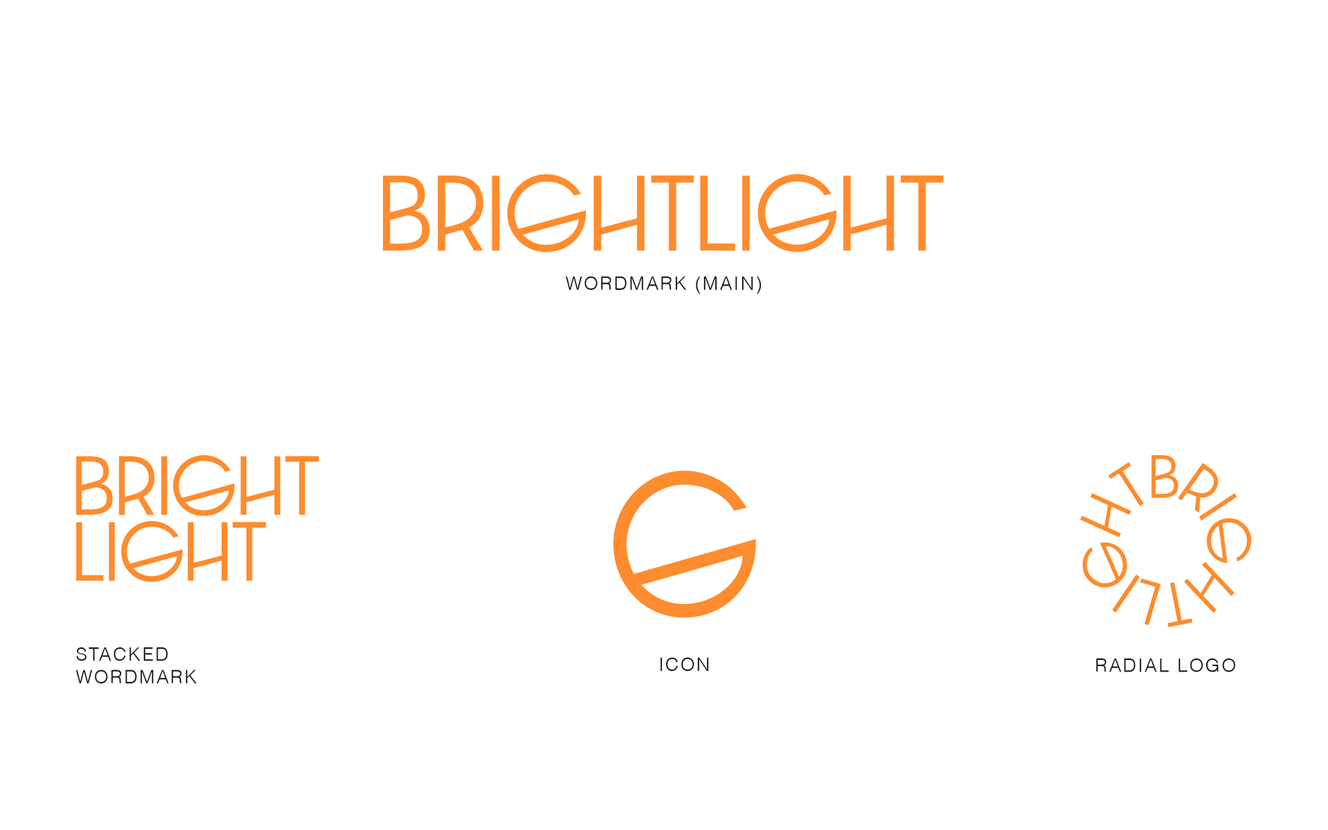
The wordmark is a custom modification of Rian Hughes's "Dazzle Unicase" typeface. In this modification, the crossbars were edited to slant 15.4 degrees. Additionally, the position of the crossbar was lowered on certain characters, making the letters appear taller and providing a tailored, own-able solution.
Brightlight
2024
SERVICES
+ Visual Identity
+ Packaging